Introduction
Recently, I was having a conversation with my father about movies—as we frequently do. Specifically, we were discussing the new Frankenstein movie produced by Netflix and directed by Guillermo Del Toro. Del Toro’s filmmaking abilities are unique. There is typically some sort of fantasy or supernatural element and a compelling narrative that drives the story along. Some of his better-known works are Pan’s Labyrinth, The Shape of Water, and a personal favorite of mine—Pinocchio. At the time of writing this article there are 2 Frankenstein trailers out for viewing. The first trailer shows the story from Viktor Frankenstein’s perspective, and the second trailer shows the story from the monster’s perspective. A nice, if not wholly unique, twist.
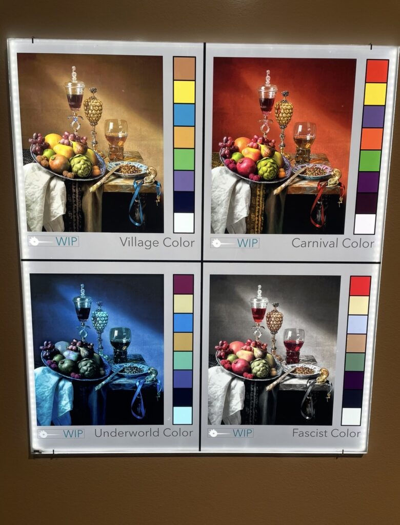
While speaking about Pinocchio with my father, I remembered going to see the stop motion sets for the movie at the Portland Art Museum. For around 8 weeks back in Fall of 2023, the art museum displayed the painted sets from Del Toro’s version of Pinocchio, and the work was incredible! Towards the end of the exhibition there was a color palette display showing the different tones and moods used in the film. For example: the village used a relatively neutral palette. The carnival incorporated more reds, oranges, and yellows—bright colors! The Underworld used hues of blues, purples, and blacks, and in Fascist Italy, blacks, whites, greens, browns, and reds were used.
This got me thinking about other creative ways to use Bouquet. As someone who does not typically feel inspired to snap photo after photo, I was curious to see if simple color blocks could create mosaics within Bouquet. This was interesting to me because exactly like the Pinocchio sets and the colors used based on the location, sets of tonal colors could be an easy way to adjust the mood of a favorite photo mosaic. Look below to see the results for yourself!
Previous Articles
Posted below are the articles related to Bouquet. Those titled Bouquet: Photo Mosaic Tutorial and Advanced Features of Bouquet are written in a tutorial style format. All the articles take less than 5 minutes to read. If you’re new to Bouquet as a platform and want to learn more about its features and how to use it, I highly recommend checking out those articles.
Introducing Bouquet: Creating Stunning Photo Mosaics
Bouquet: Photo Mosaic Tutorial
Bouquet in a Corporate Environment (Part 1)
Where to Download
The app is free to download. Use the links below.
App Store: https://apps.apple.com/app/id1494245634
Official Website: https://bouquet.sola.inc/
Test Images
When I decided to experiment with using color blocks instead of images with Bouquet, I had no idea what the result would be. Below I’ve posted the picture I snapped at the Pinocchio exhibit at the museum. The other two images of my wife and I’s golden retriever, Lia, I felt would make decent test images. One photo of Lia had a large amount of white background space that Bouquet would need to figure out how to fill in. The second image was more color diverse. I assumed the second image would be easier for Bouquet to process, and I was right.


Generating the Color Blocks
Generating the blocks of color for Bouquet to construct the mosaic was painstaking. I was probably not going about it in an efficient way, but Canva is the only readily accessible image editor on my desktop PC. It is great software, and I’ve used it extensively in the past to build presentations, create social media posts, you name it, but… the software is not always intuitive. T
After clipping two 1×8 color palettes from the Pinocchio set design, it was time to start building the blocks. I set the two blocks in an open project in Canva, then created a new 300 pixel x 300 pixel blank canvas. I copied this canvas an additional 15 times to create adequate colors to test. In total there were:
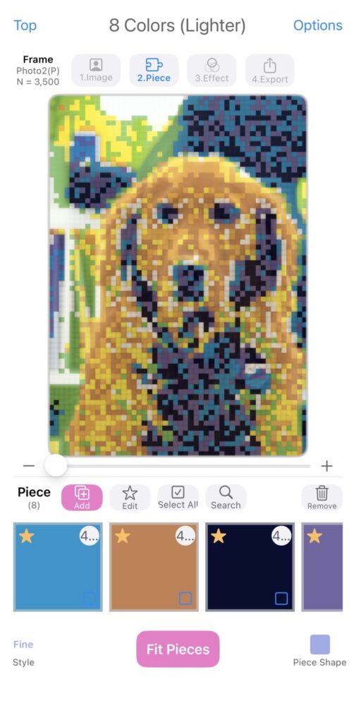
- 8 color blocks with lighter shading
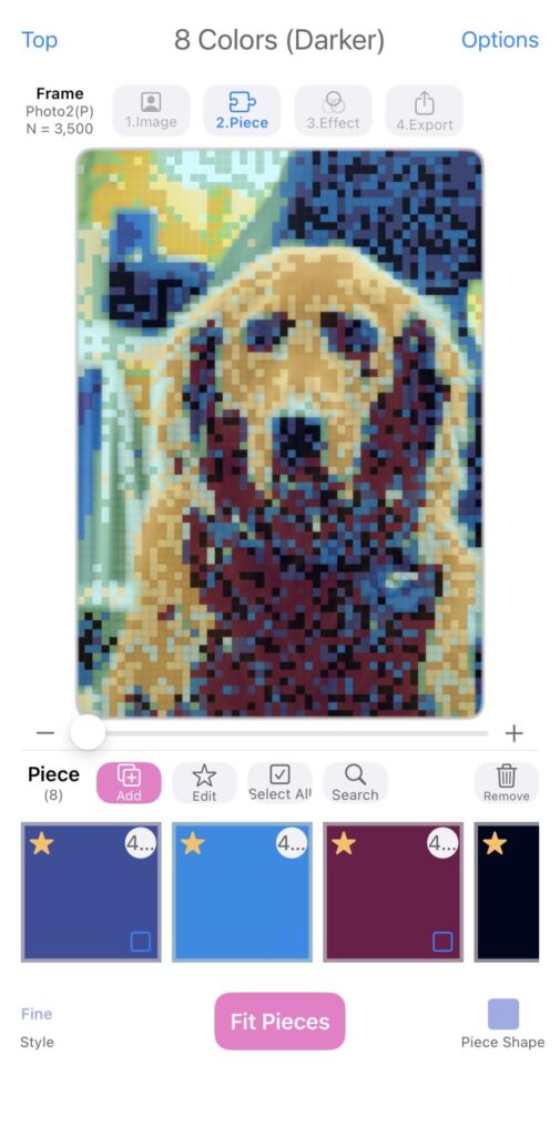
- 8 color blocks with darker shading
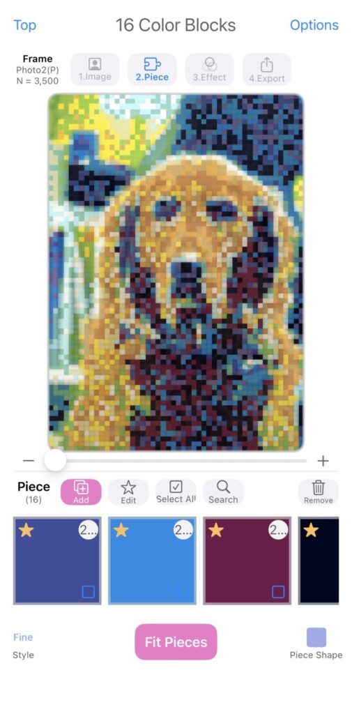
- 16 colors blocks made by combining the two palettes
The Results
Once the color blocks were formed and downloaded onto my phone, it was time to start testing. As suspected, the image of our dog with a lot of white space in the background yielded poor results. In fact, I did not believe they were worth sharing or posting, so they’re omitted in this article. The second image where Lia has a set of bookshelves behind her, I think, produced a cool set of results.
Unsurprisingly, the mosaic made with the 8 lighter shaded color blocks was a bit boring. The analogy of writing a song using any of the major scales (as opposed to minor scales) comes to mind. The results were fine, but nothing out of the ordinary. Afterwards, I used the 8 darker shaded color blocks and felt like I was looking at a piece of art. The results with all 16 colors was good, too, but I found myself drawn to the results with the 8 dark shades. I think some of that preference comes from the fact that the shading (as in shadows) filled in with the darker palette created a better outline.
From further away, you can more clearly see Lia’s eyes, nose, snout, and ears. At one point I went a little crazy and made a custom column set where Bouquet used built a mosaic with 14,00 blocks. At certain points I was concerned my phone (it’s not the latest and greatest model) might heat up and start spitting smoke. I’m kidding, but filling in that many squares took a while and I didn’t feel the results were worth the processing power.
Conclusion
Color can play a big part in mood and tone for an image. Just like in the set designs for Guillermo Del Toro’s Pinocchio, colors play a big part in our lives too. While some reading this article might feel it was a waste of time because the results weren’t perfect, I don’t feel that way. Sometimes it’s necessary to experiment and try new things. Rather than scrambling each time to add a bunch of individual piece images when creating a photo mosaic, I was curious if keeping some colored blocks in my phone’s camera reel would allow me to quickly and easily make new mosaics with only a single image.
The results, in my opinion, warrant additional experimentation to see what is possible. In the future, I think I’ll try and sample colors directly from the parent image and use color blocks specific to that image’s palette to create the mosaic. It should be interesting. We’ll catch you on the next one!
Where to Download
The app is free to download. Use the links below.
App Store: https://apps.apple.com/app/id1494245634
Official Website: https://bouquet.sola.inc/
Leave a Reply