Introduction
This is the third installment showcasing the photo mosaic app—Bouquet. Bouquet is a simple to use software that can quickly turn any group of photos into a unique and personalized mosaic. In less than one minute, the user can go from grabbing a handful of images from their camera roll or Google Photos account to creating frame-worthy photos perfect for sharing with friends, family, or to social media accounts.
In this article, we’ll be reviewing some of Bouquet’s more advanced features to fully customize your mosaic. Afterwards, you can use the same techniques seen here on your own images. For the examples, we will be using the Photo2: 5” x 7” size, listed as 127mm x 178mm within the app. Remember: for now the app is only available in the App Store for iPhone and Mac users.
Previous Articles
Introducing Bouquet: Creating Stunning Photo Mosaics
Bouquet: Photo Mosaic Tutorial
Where to Download
The Bouquet app is free to download. Use the links below.
App Store: https://apps.apple.com/app/id1494245634
Official Website:https://bouquet.sola.inc/
Initial Three Screens
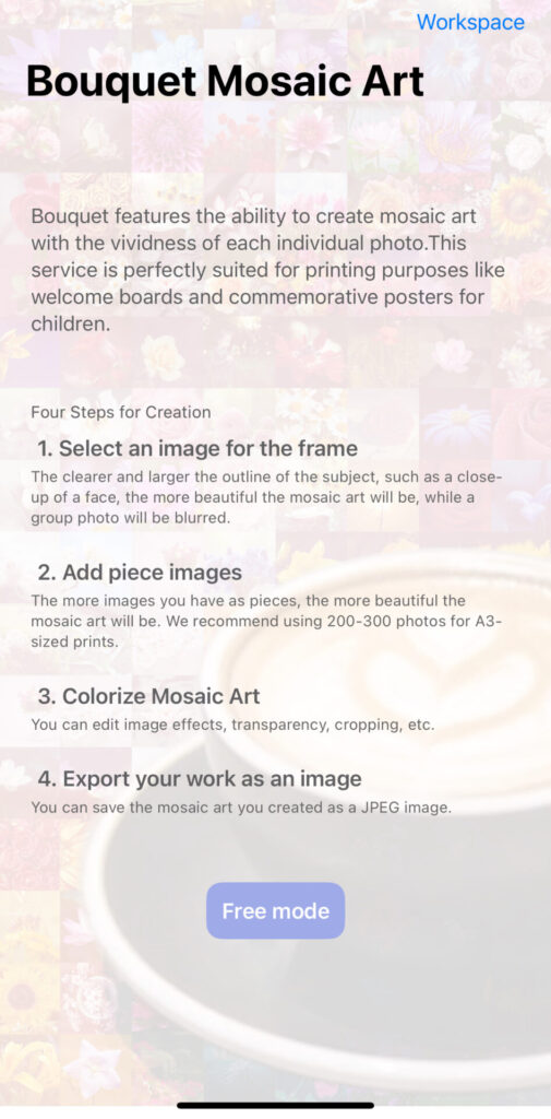
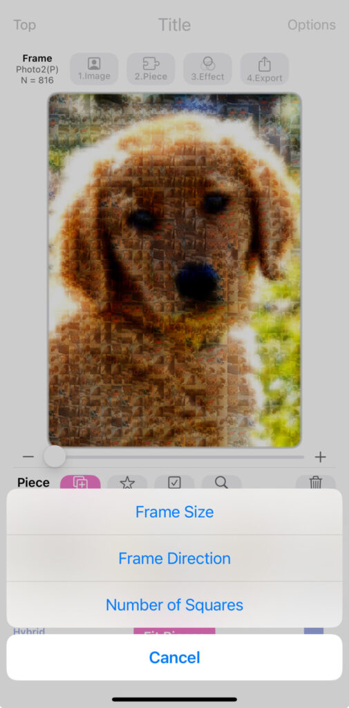
When creating a mosaic, the three settings that will most affect the final image itself are the Frame size, Frame Direction, and Number of Squares. Frame size refers to the physical measurement of the image. Frame direction can be either portrait or landscape. Number of squares changes how many total times the selected images are used to produce the final parent image.
See below for a visual a reference on what the ‘Home Screen’, ‘Frame Screen’, and ‘1. Image’ screens look like.


Number of Photo (N) Differences
As we discussed above and in the Bouquet Picture Sample article, the ‘N’ setting changes the total number of times the ‘pieces’ images are used to produce the parent image. This is important because depending on the desired outcome, a smaller or larger N number is chosen. The fewer squares (N) selected, the more detail is visible on the mosaic pieces themselves. Selecting a higher square (N) count will produce mosaics with a sharper parent image, but reduced detail on piece images.
Below are three examples. The left-hand image used 204 squares. The center image used 816 squares, which strikes a nice balance between the parent image clarity and piece detail. The right-hand image shows a whopping 1,440 image count, where the parent image detail is much sharper. As the user, it may be better to choose a higher N count if the ‘piece’ photos themselves are not particularly clear or well-framed photos.
I mentioned in a previous article that I’m a far less talented photographer (using a phone or with a proper camera) than my wife. As such, I prefer to use a higher N value to hide my amateur photography skills.


Customize: Primary Effects and Alpha
Primary Effects
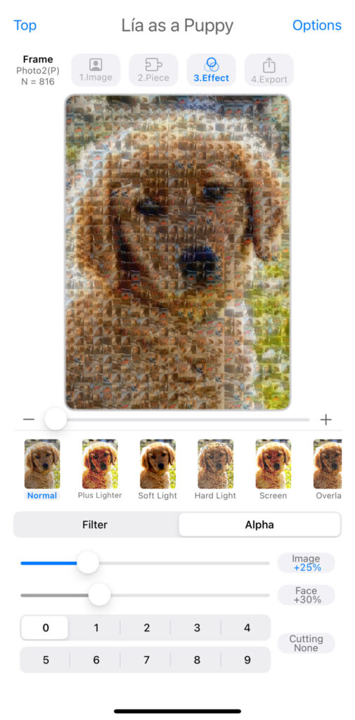
At this point, we’ve covered the Frame, 1. Image, and 2. Piece settings extensively. Now let’s move on to 3. Effect. Right below the parent image mosaic, there are several primary effect filters: Normal, Plus Lighter, Soft Light, Hard Light, Screen, Overlay, Lighten, Darken, Multiply, Luminosity, Color Dodge, Color Burn, Difference, and Exclusion. Experimenting with these fourteen different primary effects is as simple as clicking or tapping. Don’t be shy! The sample photo above is of my wife and I’s dog, Lia, when she was a puppy. I chose the Soft Light effect that enhances any sunlight captured, blending the image’s fringe details.
Below are three sample mosaics with different effects so you can more easily visually reference the differences. Normal is the unfiltered version. Plus Lighter, in my opinion, gives more of a rustic look and feel, while Soft Light ramps up the cuteness factor—exactly what I wanted for a puppy photo.


Alpha
The alpha setting adjusts how pronounced the parent image is compared to the individual pieces. The default setting is 10%. Personally, I really appreciate it when software companies make it simple to revert back to default settings. Sometimes I mess up my settings accidentally and it can be frustrating resorting to web searches on how to ‘fix’ everything.
On the iPhone version of Bouquet, used in this article, the slider bar below the primary effects options adjusts the alpha. Tapping Image, Face, or Cutting buttons on the lower-right of the screen will revert each to their default. There is a nice visual representation as well, which I appreciate—if a slider is moved from its default position, the percentage turns from gray to blue. Fantastic! Below, the difference between 25%, 50%, and 75% image alpha is shown. The higher the image alpha percentage, the mosaic pieces become less pronounced and the parent image has a sharper resolution.


Conclusion
The beauty of Bouquet as an application is its simplicity and ease of use. Personally, I am neither skilled at taking photos nor at editing them. I cannot tell you how many times I’ve failed miserably when my wife asked me to take photos of us out and about town or on vacation. Sure, I’ve gotten better over the years, but it’s nice when a program like Bouquet can do all the heavy lifting. Customizing your creations is only a tap or slider bar away.
Playing around in the Bouquet app I’m reminded of electronic music artists building tracks in the studio. Is there a certain expertise they use in morphing sounds for a unique hook, melody or bassline? Absolutely, but just as often you’ll see them turning randomly adjusting knobs in different plugins, then all the sudden—whoa! The perfect sound emerges.
It’s the same with Bouquet. There’s no right or wrong way to use the app. Play around with the settings and please be sure to tell us about your awesome creations by commenting below, emailing the author at michael@sola.inc, or tagging us when posting on social media with #PhotoMosaic and #BouquetApp.
Leave a Reply